CloudM
Redesign, REBUILD AND PARTNERSHIp
Turning complex cloud services into clearer digital journeys

CloudM helps IT teams migrate, manage and protect business-critical data across the Google and Microsoft ecosystems.
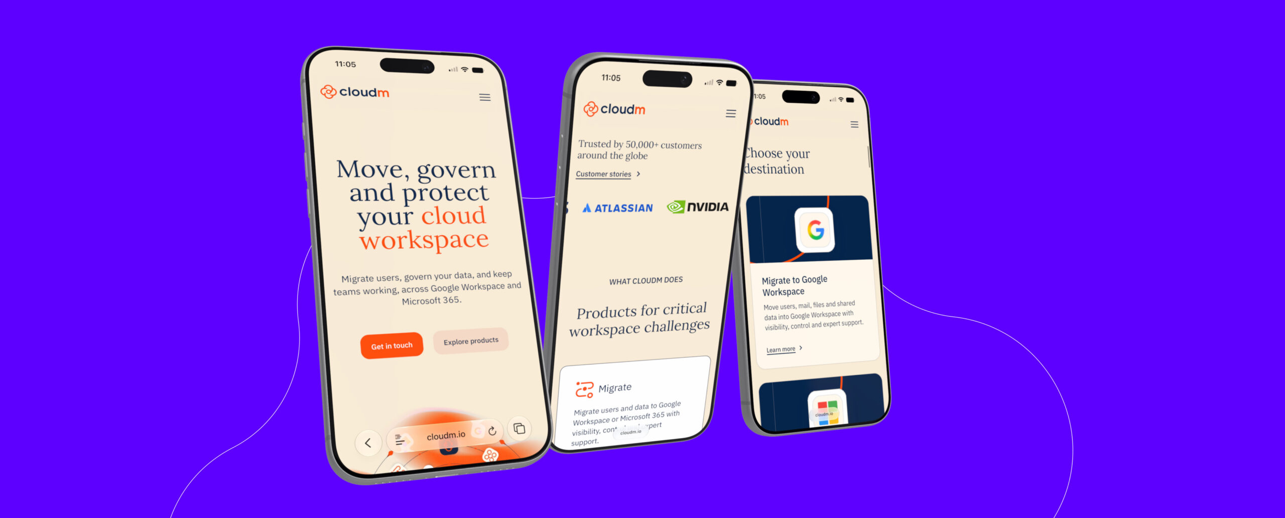
We redesigned and rebuilt its website to create a more coherent expression of the brand and a clearer experience for both customers and internal teams. The new platform combines flexible content tools with improved product journeys, interactive pricing and ROI features, stronger customer stories and a more purposeful approach to lead generation.
Takeover
We took over stewardship of its WordPress website in 2025. The site had been built around a bespoke ACF flexible-content system created by a previous agency. Although functional, it was difficult to work with, visually restrictive and full of quirks that made even relatively simple improvements harder than they needed to be.
Our initial work following our takeover focused on stabilising the platform, fixing bugs and making targeted improvements. Alongside that day-to-day support, we introduced more substantial new functionality, including a flexible pricing experience and an interactive ROI calculator designed to communicate the potential efficiency savings of CloudM’s products.
The first year also gave CloudM time to assess what was working, where the existing platform was creating friction and which improvements would have the greatest impact. As we became more familiar with the site, its content and the needs of the wider team, the limitations of the underlying system became clearer. That shared understanding helped shape the decision to move beyond incremental fixes and invest in a more comprehensive redesign and rebuild.
Redesign and rebuild
With the priorities for the new site now clearly defined, we redesigned and rebuilt the platform from the ground up. The new site combines a more flexible WordPress block system with clearer customer journeys, a refreshed visual identity and a stronger foundation for CloudM’s products, solutions, resources and customer stories.
Redefining the visual direction
The redesign began from first principles rather than as an iteration of the existing site. We explored how CloudM’s brand should translate into a more modern, dynamic digital experience, then developed a new visual system around clearer hierarchy, stronger layouts and more polished interaction design. The result feels recognisably CloudM, but more consistent, considered and distinctive across the site.
We also revisited the CloudM logo as part of that process. The existing identity relied on a minimal wordmark, so we introduced a simple standalone icon that could give the brand a more recognisable presence across the website and wider communications. Its form deliberately sits between several ideas: a cloud, flower, cog, fan and loading spinner. This reflects both the CloudM name and the movement, management and automation at the heart of its products. The result remains clean and understated, but gives the identity a more distinctive and versatile visual asset.
A more flexible publishing system
The rebuilt site uses our standard Gutenberg block approach, replacing the previous custom page builder with a more visual and intuitive publishing platform.
CloudM’s team can now assemble pages from a broader and more versatile library of components, including irregular bento-style card grids, more visually prominent testimonials and fluid, app-like content sliders. The system gives editors more creative freedom while maintaining consistency across the site.
We also revisited the wider content structure. Blog posts now play a less prominent supporting role, while a dedicated customer story content type gives real-world outcomes greater visibility across the site.
Pricing designed around customer needs
CloudM’s offering varies according to the customer, product and level of support required, so a conventional pricing table would not have been enough.
We designed and built a more sophisticated pricing interface that guides visitors through different routes according to their needs. The component includes numerous states and variations, helping users narrow the offering without overwhelming them with every possible option at once.
The same system can also be configured for more focused landing pages, where only the pricing routes relevant to a particular product or service need to be shown.
Making value easier to understand
We also redesigned CloudM’s ROI calculator, simplifying the experience and removing some of the visual complexity of the original version.
A new streamlined entry point uses a responsive range-slider interface to give users immediate feedback as they interact. This creates a low-friction way to explore potential efficiency savings before moving into the more detailed calculator.
Together, the calculator and pricing tools turn complex commercial information into clearer, more useful customer journeys.
Better-qualified enquiries
The previous website used a very short contact form that gathered little information and gave visitors limited indication of what would happen after submitting.
We replaced it with a clearer multi-step experience that explains the process, asks relevant questions and sets better expectations along the way. Visitors can submit with greater confidence, while CloudM receives the context needed to route enquiries effectively and prepare for a more useful follow-up.